An accessible, navigable lesson template for a collaborative, inclusive educational community
Product: Responsive Web | My Role: Contract Product Designer | Timeline: 4 months | Company: The Carpentries
Intro:
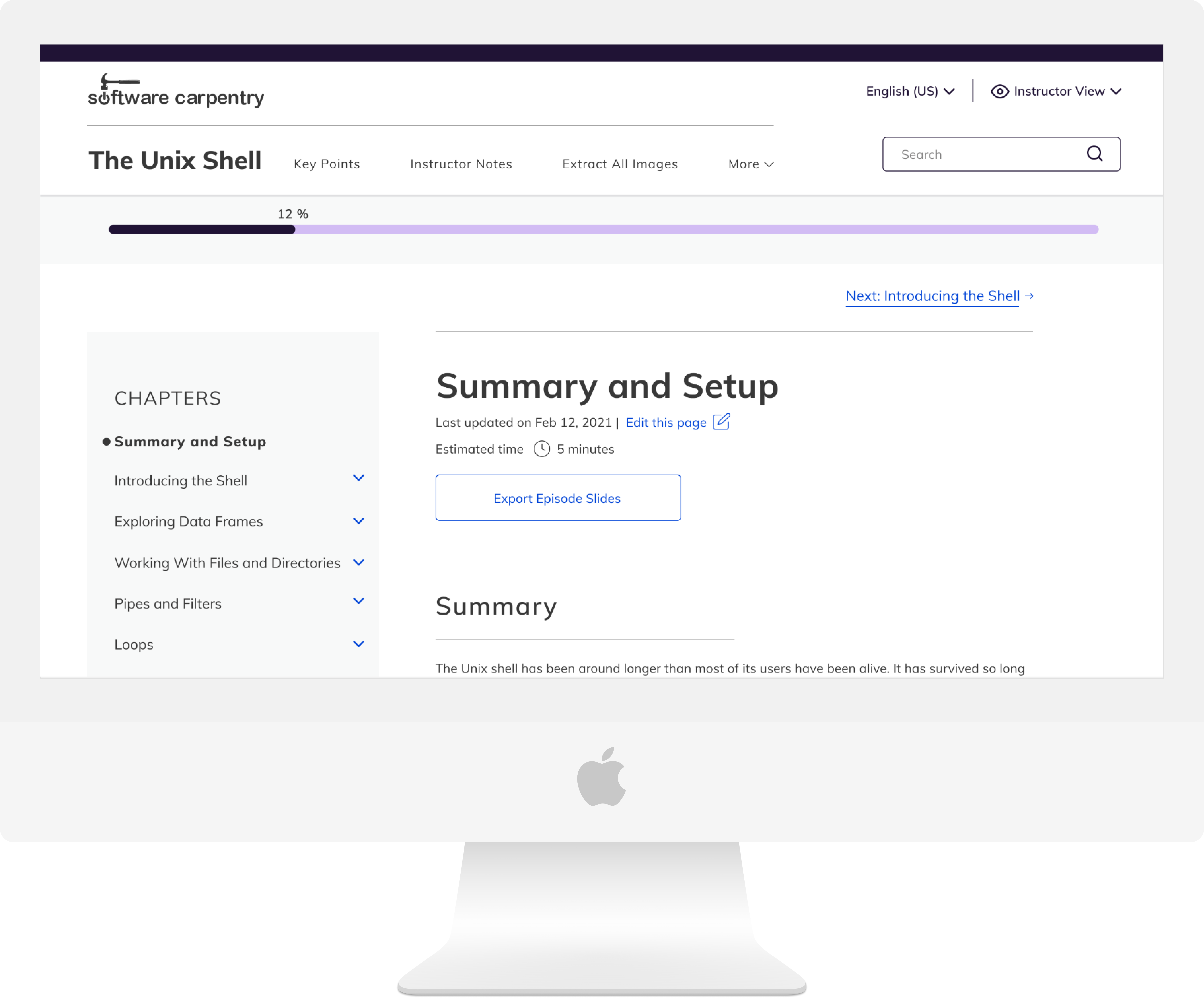
The Carpentries is the leading inclusive community teaching data and coding skills. The lesson template they used for all of their lessons (across their suite of communities) was in need of a refresh to better serve their diverse group of community members.
The Problem
👎 The template didn't serve the different needs of its diverse users, especially learners and instructors
👎 The template didn't conform to web accessibility standards
👎 The template was not responsive and didn't perform across device types, limiting the ways in which both learners and instructors could use it
The Team
🙋♀️ Designer
✅ 1 developer
✅ Multiple stakeholders
The Results
✅ As a contractor, it's sometimes difficult to get results once your contract ends—I'm working on getting some data! I'm interested in seeing adoption percentages as well as anecdotal feedback from the Carpentries' community.
✅ Designs performed very well in all testing (3 different rounds)
The Process


The Solution
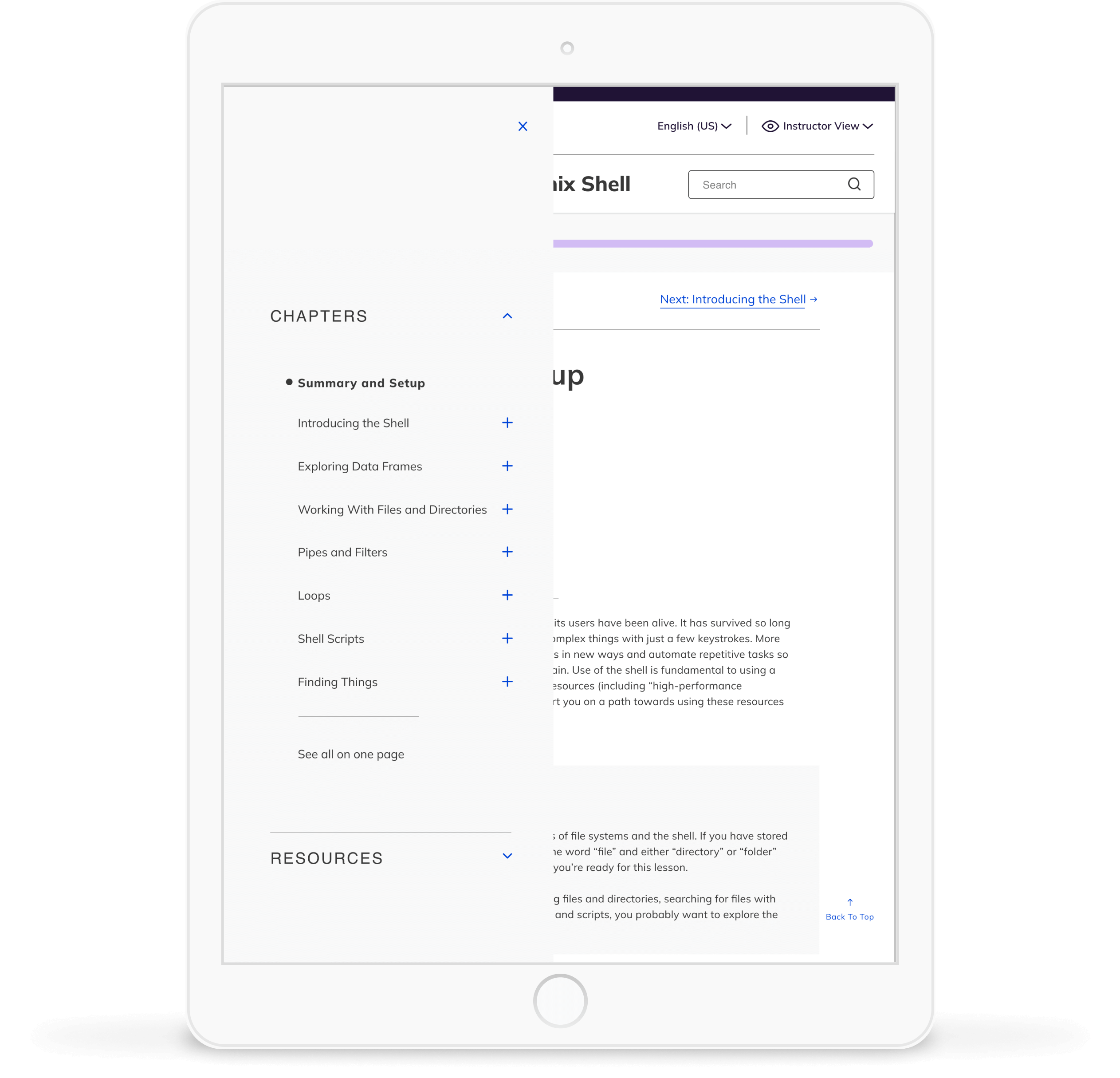
Navigability! I introduced a navigable sidebar and a loading indicator to give both instructors and learners the ability to understand their progress and jump around as need be.


The Solution
I also added both a learner and an instructor view to accommodate their different needs
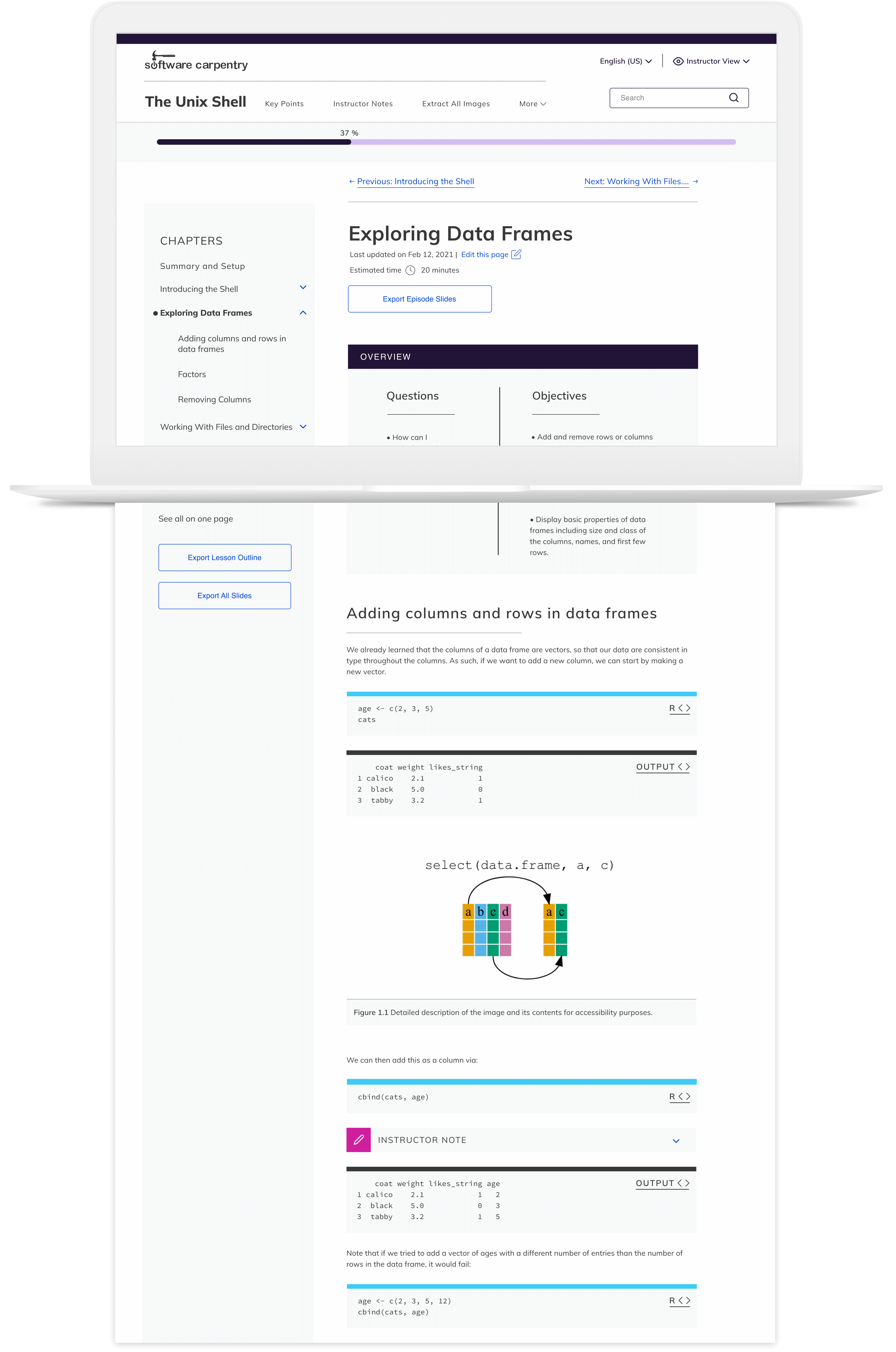
Instructors can now easily access their notes, export slides of specific sections or all at once, extract images and export a lesson outline.

Learners don't have any superfluous information but instead have access to key points, learner profiles and the glossary of terms to help them succeed.
The Solution
I made sure to optimize the lesson template for accessibility and readability
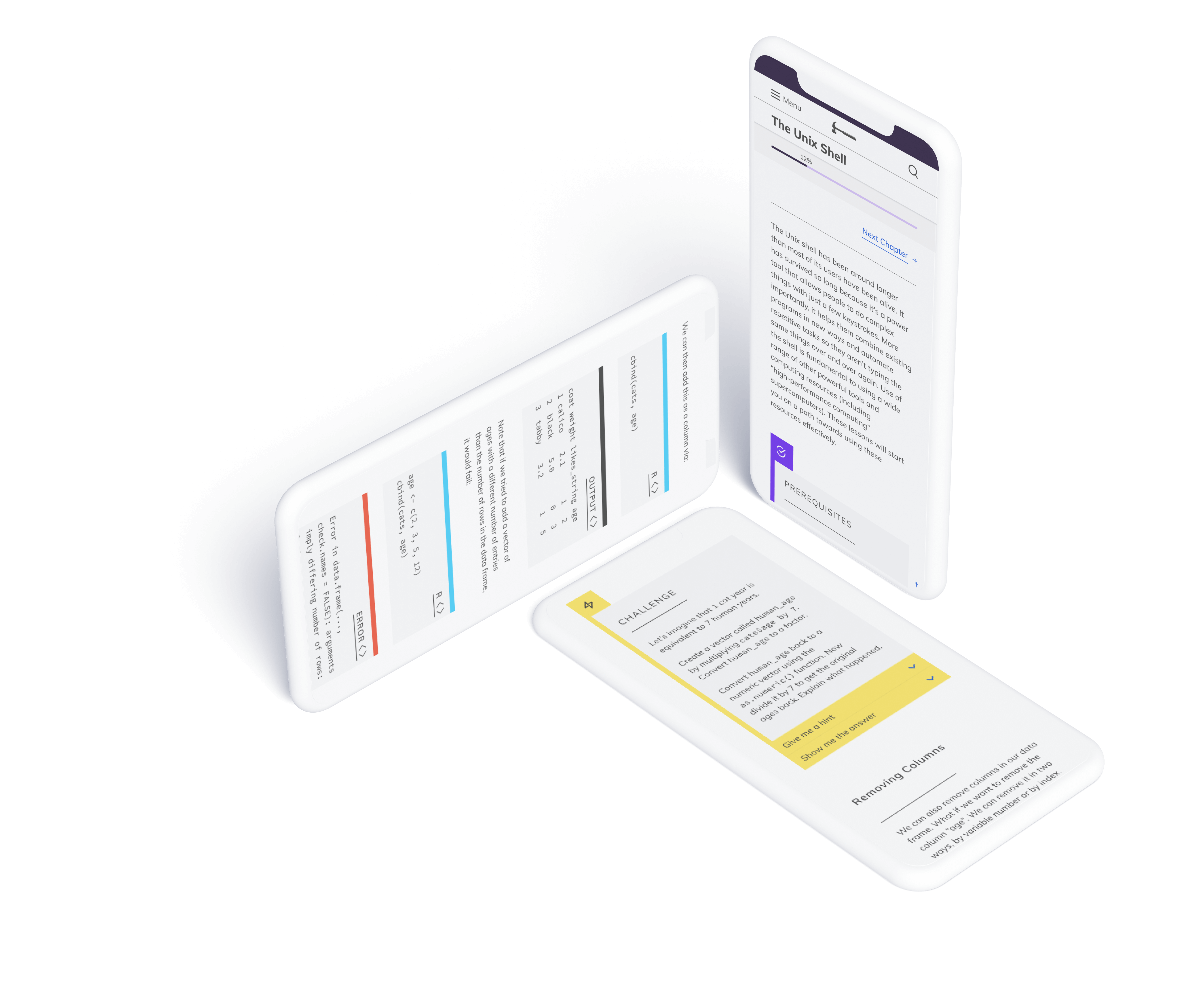
The sometimes dense content is now readable thanks to an update to a Google font and optimized spacing. Additionally, all colors meet AAA contrast standards for web.
The Solution
I also delivered a reusable and responsive design system
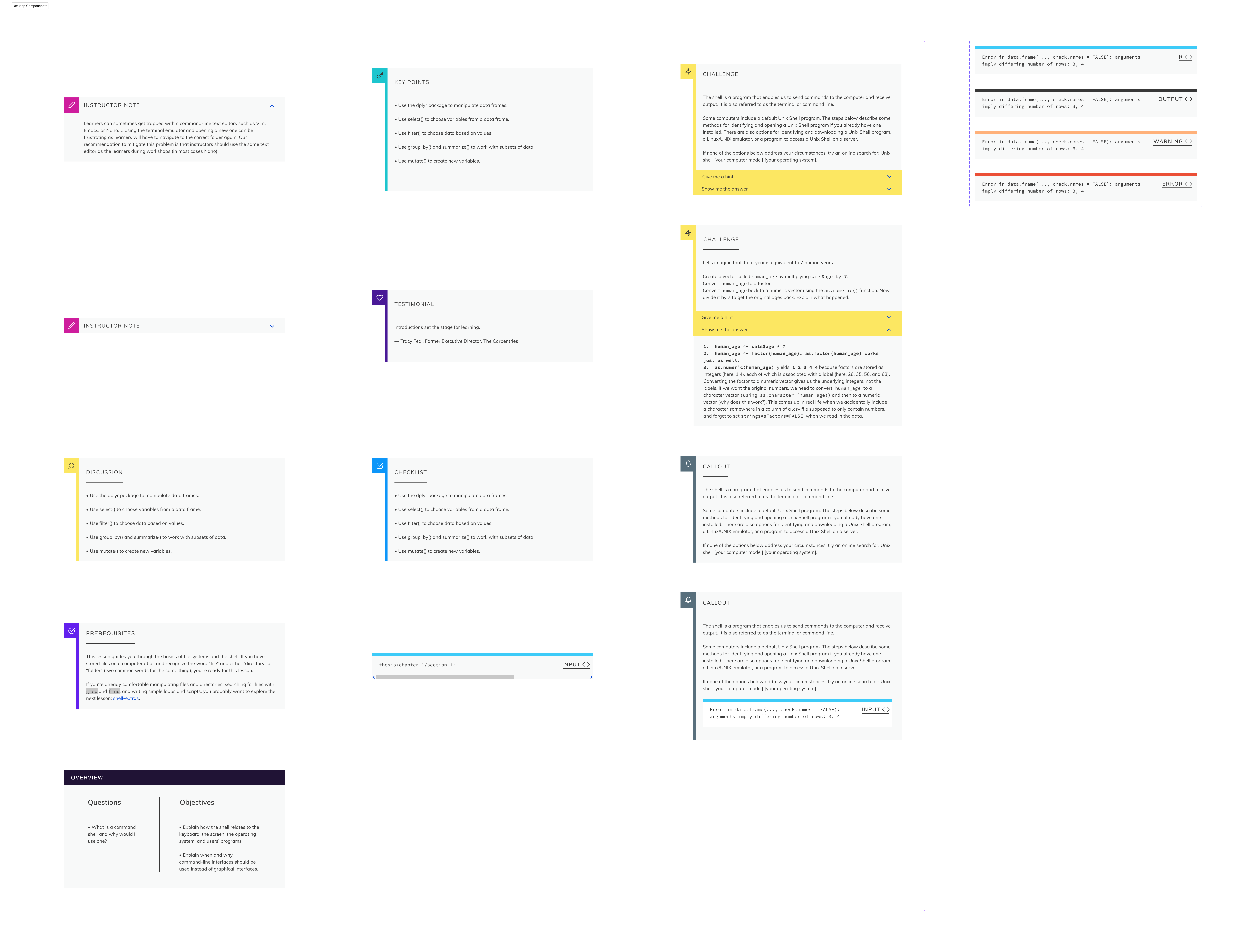
The Result
The Carpentries community was thrilled to have a responsive, navigable lesson template to use across their workshops

Explore other selected work